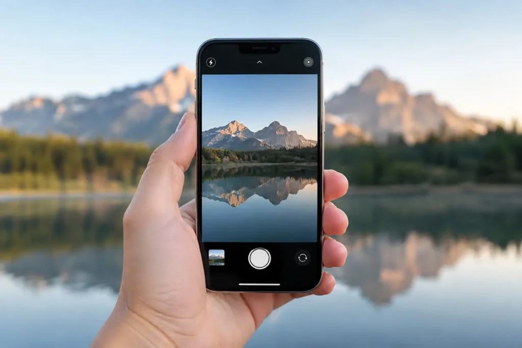
Camera Grid

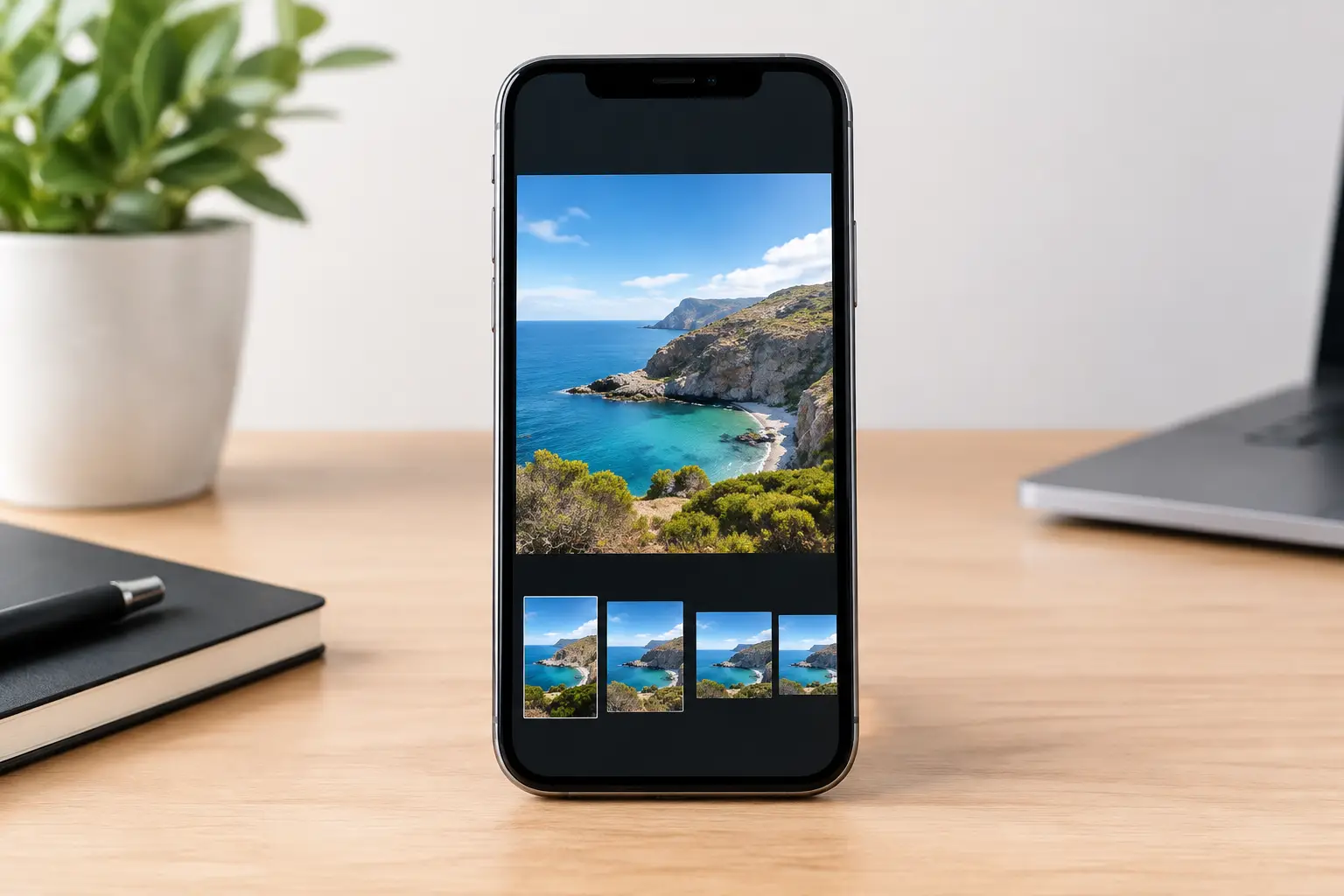
A wide landscape can feel cramped in 4:3. A close portrait can lose its force in 16:9. iPhone photo aspect ratios determine the shape of the frame before you decide where your subject belongs inside it.
That decision is not cosmetic. It changes the relationship between subject, background, negative space, and the edges of the image. Choose the ratio first when the final use is clear. Keep the full frame when you need flexibility later.
iPhone Photo Aspect Ratios: Start With the Frame
An aspect ratio describes the proportional relationship between an image’s width and height. It does not describe image quality, resolution, or whether the phone is held vertically or horizontally. A 4:3 photo can be landscape or portrait. So can 16:9.
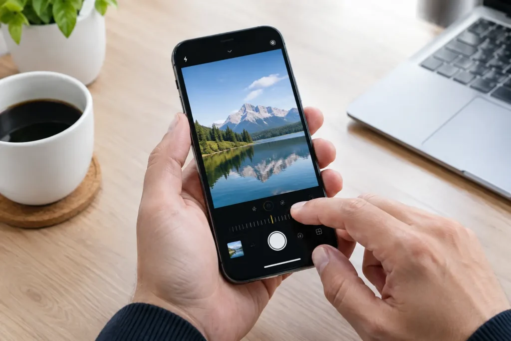
The iPhone Camera app offers 4:3, 16:9, and Square capture options. Open the camera controls, tap the current ratio, and select the shape you need. The exact placement of this control varies slightly by iOS version, but it is available from the camera interface.
For most still photos, 4:3 is the best place to begin. It uses the full native photo area, giving you more room to crop later. Square and 16:9 create a more specific frame at capture. That can sharpen your decision-making, but it also removes pixels beyond the chosen edge.
Think of the ratio as your first compositional boundary. Once it is set, every line, face, and object has less or more room to breathe.
Use 4:3 When You Need the Most Options
The 4:3 frame is the iPhone’s standard photo shape. It is slightly taller than many screens and slightly less wide than a television-style image. That extra height is useful because real scenes are rarely arranged perfectly when you first see them.
Use 4:3 for travel, family moments, street scenes, food, and any situation that moves quickly. It gives you margin around a child who suddenly runs, a building whose top is easy to clip, or a plate with distracting tableware that you may want to remove later.
It is also the sensible choice for ProRAW and high-resolution work. Capture the fullest practical frame first, then crop with intent after you have time to inspect the image. A crop can improve a composition. A missing edge cannot be restored.
4:3 does require discipline. A larger frame can invite clutter. Do not treat extra space as permission to include everything. Identify the subject, then move closer, lower the phone, or shift left until the background supports it. Keep the frame broad only when the surrounding context adds meaning.
For a portrait, leave room in the direction the person is looking. For architecture, protect the top corners and avoid cutting off a roofline. For food, use the additional frame to establish the table setting only if it strengthens the story.
Choose 16:9 for Width and Motion
A 16:9 frame is wide and cinematic. It works when horizontal space is the point of the image: a distant horizon, a long dining table, a row of buildings, or a subject moving across the scene.
In landscape orientation, 16:9 naturally favors strong horizontal structure. Put the horizon deliberately high or low. A horizon running through the center can work when reflection or symmetry is the subject, but it often splits an otherwise ordinary landscape into two equal, competing halves. Commit to the sky or commit to the land.
In portrait orientation, 16:9 becomes a tall, narrow frame. This can be effective for skyscrapers, waterfalls, doorways, and a single standing figure. It is less forgiving for groups. One small shift can crop a shoulder, hand, or edge of the scene that makes the image feel complete.
Use 16:9 when you already know the image will live in a wide display, video sequence, presentation, or social format that favors a broad frame. Do not choose it simply because it looks more dramatic in the viewfinder. If the scene depends on vertical detail, capture 4:3 and crop after.
A practical test: if the strongest visual elements travel from left to right, try 16:9. If they stack from foreground to background or rise from bottom to top, 4:3 may hold the scene together better.
Use Square for a Clear, Contained Subject
The 1:1 square is strict. That is its advantage. It reduces the temptation to let empty edges dilute the picture.
Square works especially well for faces, a single dish, flowers, graphic details, symmetrical facades, and objects photographed from directly above. The frame gives equal visual weight to height and width, so centered composition often feels more stable here than it does in a rectangle.
Centering is not a default rule. It works when the subject is symmetrical, self-contained, or visually dominant. A front-facing portrait, a coffee cup on a clean table, or a doorway with matching sides can hold the center with confidence. If the background is uneven or the subject is looking off-frame, move the subject away from center and leave space in the direction of the gaze.
Square can make a busy scene feel trapped. If you need a sense of place, movement, or distance, the ratio may be too tight. Step back and use 4:3 instead. You can still crop square later, once you know exactly which surrounding details deserve to stay.
Crop to 3:2 When the Image Needs a Classic Rectangle
3:2 is familiar because it matches the proportions of traditional 35mm photography. It is slightly wider than 4:3 without becoming as panoramic as 16:9. The result often feels balanced for portraits, travel images, and print-like compositions.
The native iPhone Camera app does not typically offer 3:2 as a capture ratio. Shoot in 4:3, then crop in Photos when the image calls for it. This is a good workflow because 3:2 is often a refinement, not a decision you need to make in a fast-moving moment.
Use 3:2 when the original 4:3 image feels a little tall, especially in horizontal images with a clear subject and a supporting background. Remove unneeded foreground or empty sky. Keep an eye on edge tension: do not crop so close to a person, tree, or building that it looks accidental.
For vertical portraits, 3:2 creates a taller, narrower shape than 4:3. It can emphasize a person’s full figure or create a more editorial feel. It can also make the frame feel restrictive if hands, clothing, or environmental details are part of the story.
Match the Ratio to the Composition
Aspect ratio and composition work as one decision. A rule-of-thirds placement may feel spacious in 4:3 but too close to the edge in 16:9. Centered symmetry may feel deliberate in Square but static in a wide frame. The ratio changes the distance between your subject and every boundary.
Before you shoot, ask one practical question: what must remain in the image? If the answer is a face and a clean background, use Square or crop tighter. If it is a person, their surroundings, and the direction they are moving, keep 4:3. If it is the sweep of a coastline or a line of architecture, test 16:9.
Then check the edges. Scan all four before pressing the shutter. Remove bright distractions, partial objects, and awkward tangencies where a line appears to touch a head or shoulder. A better aspect ratio cannot rescue careless edges.
Camera Grid can help make this decision in the live viewfinder by selecting composition guides that fit the scene, from thirds and symmetry to leading lines and reflections. The ratio remains your call. The guide helps you use that shape with purpose.
Capture Wide, Crop With Intent
There is no single best ratio for every iPhone photo. The right choice depends on the scene, the final destination, and how certain you are at the moment of capture.
When the moment is fleeting, use 4:3 and frame cleanly. When the final shape is obvious, choose it before shooting and let the boundaries force a stronger decision. On your next photo, set the ratio first, check the edges, and make the frame earn every inch.